Layer Types
Creation of Layers
The advanced users of type Author/Creator can manage (create, edit, delete) layers thanks to a rich and easy to use wizard offering:
- Rich renderer: symbols, color palettes, proportional circles, multiple indicator pie chart diagrams with variable size, labels
- Advanced settings: color, size, thickness of lines and contours, transparency...
- Several methods of discretization: unique value, range of values, quantile, natural breaks
- Analysis on layers of points, lines or polygons
Managing layers (create, edit, delete) is done using the Layers Wizard called from the layers menu. It is only localized in English, French, German & Spanish.
To create a new layer, click on the add button, and then click on the "Layer" point of the menu appearing.
To edit an existing layer, click on the edit button, that becomes available by clicking on the layer name.
To delete an existing layer, click on the delete icon, accessible in the same manner as the edit button.
The Layer Wizard appears in a new tab, listing the different types of representation available.

Select a representation in order to access the parameters.
Each available type of layer is detailed individually in the corresponding chapter.
Layer Types
Selection of the Layer Type
Depending on the available data, the user can select the type of layer desired to appear on the maps. However, all the data do not support all the types of layers.
The following table suggests a review of possible presentations of data according to its type:
| Data Type | Example | Representation Mode | Galigeo Layers |
|---|---|---|---|
| Qualitative | Type of point of sale: wholesale or retail, Regional alert level | Individual | Symbols, Unique values, Pie charts |
| Quantitative | Turnover by sector, Number of stores in a region | Proportional | Symbols, Proportional circles, Flow, Pie charts |
| Quantitative relative | Nitrate levels, Success levels of mailing | Relative, ordered | Color ranges, Symbols, Flow, Pie charts |
Layer with a Default Symbol
This type of visualization allows displaying all of current data on a map layer with the same renderer.
This type of layer applies to polygon, line and point layers.
The creation of this type of layer is done by following the next steps:
Step 1: Enter the Layer Name
Step 2: Select the Data Set
Step 3: Select the Symbology
Choose a symbology type:
- Fill colours and borders: One can change the default rendering colour of each object of the layer, the fill type (Solid or hashed), and the colour and width of the border.
- Vector Symbol: to choose an SVG symbol, its color, its size, and its offset for each objects of the layer.
- Image from the library: to choose the image we wish to use, and the offset relative to the point. The + button allows the import of new symbols. The vector symbols have to be in SVG format, and the images in PNG format.
Step 4 (Optional): Use the ArcGIS Native Symbology
When the selected query is based on an ArcGIS layer (see Data panel > Mapping Wizard), it is possible to configure the layer to use the symbology defined on the ArcGIS Server.
Step 5 (Optional): Use as Mask Layer
Only available if the Geographical Level selected relies on polygons. When enabled, instead of showing the polygons colored as usual, it will crop them out, and use the outer boundaries as a mask.
Setting the Transparency
Step 6: Enter the group name where the layer will be inserted
Enter in the Group Name field the name of an existing group or of a new group where the new layer will be inserted.
Step 7: Validate the Layer Creation
Layer by Gradient Colors (or Range Color)
This type of layer enables the distribution of numerical data in several value ranges according to manual or statistical discretization. To each value range will correspond a renderer on the map.
This layer type can apply to polygons, lines, and points.
Step 1: Enter the Layer Name
Step 2: Select the Data Set
Select the classification field:
Step 3: Select the Calculation Method and the Representation
The different representation classes as well as the labels associated to each one of them are displayed in the table once done the selection of the field to represent.
Selection of the calculation method
There are 5 value ranges calculation methods available:
- Quantiles: this method divides automatically the values in a manner that each range has an identical number. The boundaries are automatically calculated (and recalculated at every query refresh).
- Equal Interval: this method divides automatically the values in intervals of the same size.
- Natural Breaks (Jenks method): this method divides automatically the values in homogeneous intervals defined by the reading of the bar chart of frequencies of the series.
- CK-means (default method): This method partitions the data into k ranges so as to have an optimal and deterministic distribution.
- Manual: this method allows to define manually the range of values.
Selection of the representation type
One can choose an already predefined colour gradient, or distribution of colours by clicking on the button. A palette of available colour representations will appear.
One can choose one of the predefined colour distributions, or define a custom gradient by going to the Custom tab, or copy an existing one from an already created layer by going to the Copy from Existing tab.
Symbol Propagation
The propagation icons situated at the right of the symbols allow the fast propagation of symbol property in order to be more efficient. According to the type of symbol, it is possible to propagate the type, the colour, the size, the border or the offset (for lines).
Adding/Deleting of classes
Step 4: Enter the group name where the layer will be inserted
Step 5: Validate the Layer Creation
Layer by Individual Colors
This type of layer allows displaying of data that have a single value through colored symbols.
This type of representation is applied mostly to fields of alphanumeric values (strings), however it is also usable on numeric fields.
Step 1: Enter the Layer Name
Step 2: Select the Data Set
Step 3: Select the Representation
The table with the color distribution is displayed. The labels can be modified by the administrator. To switch to edition mode, simply click on the label and enter the desired text.
Step 4: Enter the group name where the layer will be inserted
Step 5: Validate the Layer Creation
Layer with Proportional Symbols
This type of layer makes it possible to distribute the numerical data proportionally according to their values.
This type of layer can be applied to the various types of objects contained in a geographic layer (points, lines, polygons).
Step 1: Enter the Layer Name
Step 2: Select the Data Set
Step 3: Select the Fill Color, the Reference Value, the Reference Size, the Maximum Size (optional) and the Scale
With the help of these controls one can set the color the symbols will be filled, the reference value, the reference size and, the maximum size (optional) of the representation of the symbols.
For more detail on the meaning of those fields, you can click on the help button.
Step 4: Enter the group name where the layer will be inserted
Step 5: Validate the Layer Creation
Layer by Pie Charts
This type of representation allows the display of several indicators using pie charts.
This type of representation applies mainly to fields with numerical values.
Step 1: Enter the Layer Name
Step 2: Select the Data Set
Step 3: Select the fields to be represented in the pie charts
Select a field in the drop down list and click on the + button to add it to the representation. Repeat the above operation until you entered all fields you wish to represent in the pie chart.
Step 4: Enter the group name where the layer will be inserted
Step 5: Validate the Layer Creation
Layer with Flows
This type of layer works in the same way as the one by Range of Color with the difference that the quantities are represented in the form of flows between two points.
Here are some examples of use cases:
- Analyze the financial flows, of merchandise or persons between different sites, factories, ports...
- Analyze the movement of people or migration between countries, regions, counties
The Flow layer needs the following prerequisites:
- The flows are mapped on one and only one existent dataset of points (shops, sites) or polygons (counties, countries)
- The BI query data have to contain the origin and destination dimensions formatted as follows:
| Origin Dimension | Destination Dimension | Indicator |
|---|---|---|
| CodeWWW | CodeXXX | 1000 |
| CodeYYY | CodeZZZ | 1500 |
- The joins have to be configured on the two geographical dimensions (origin, destination)
- The query has to have two geographical dimensions (the first being the start and the second being the destination data)
Step 1: Enter the Layer Name
Step 2: Select the Data Set
When defining a flow layer, the author decides which are the origin and destination mappers.
Step 3: Select the Calculation Method and the Representation
The same calculation methods as for Gradient Colors are available: Quantiles, Equal Interval, Natural Breaks, CK-means, and Manual.
Step 4: Enter the group name where the layer will be inserted
Step 5: Validate the Layer Creation
Labels Creation
It is possible to associate labels to any of the layers.
This type of representation allows the displaying of one or several indicators on the map.
All types of layers have a section for labels:
Step 1: Enter the Label Content
It is possible to insert custom text in order to format the label. The use of HTML tags is not supported in the labels with the exception of the <br> tags in order to insert a line feed.
Step 2: Select the Font Size
Step 3: Select the Font Color
Step 4: Set the Horizontal/Vertical Offset
Step 5: Set the background color of the label
If a layer has a label declared, the icon is displayed in the Layers panel, allowing the toggling of the labels display.
Tooltip Creation
It is possible to configure customized tooltips for a layer. The tooltips work in the same manner as the labels and allow the displaying of a formatted text when hovering with the mouse.
Contrary to the labels, the tooltips support HTML formatting that allows an advanced customization.
Layer Groups Management
By default, the layers are grouped by the data set name on which they are based.
These groups are customizable from the Layer Wizard, or one can change their names directly in the Layers panel.
For each layer, the author has several possibilities:
- Choose an existing group (the existing groups are suggested in the drop-down list). At the layers panel, the layer will appear in the selected group.
- Define a new group name. A new group will appear on the layer panel and will contain the layer that is about to be edited.
Every group has a main switch that can turn the whole group, i.e. all the layers inside the group, on or off with one click.
An author hovering with the mouse over the group name: a pencil edition button will appear, and if it is clicked, the edition of the group name will be enabled.
If, after the edition, there will be another group with the same name, then a merging suggestion message will be displayed, through which the modified group can merge with another existing one.
Webservices
The author can add webservices by entering the URL of the service or of the layer. This functionality allows to enrich a map with geographical data coming from an external service in a rapid mode (ArcGIS or WMS).
Webservices management is accessible from the map burger menu > Settings > Data > Webservices.
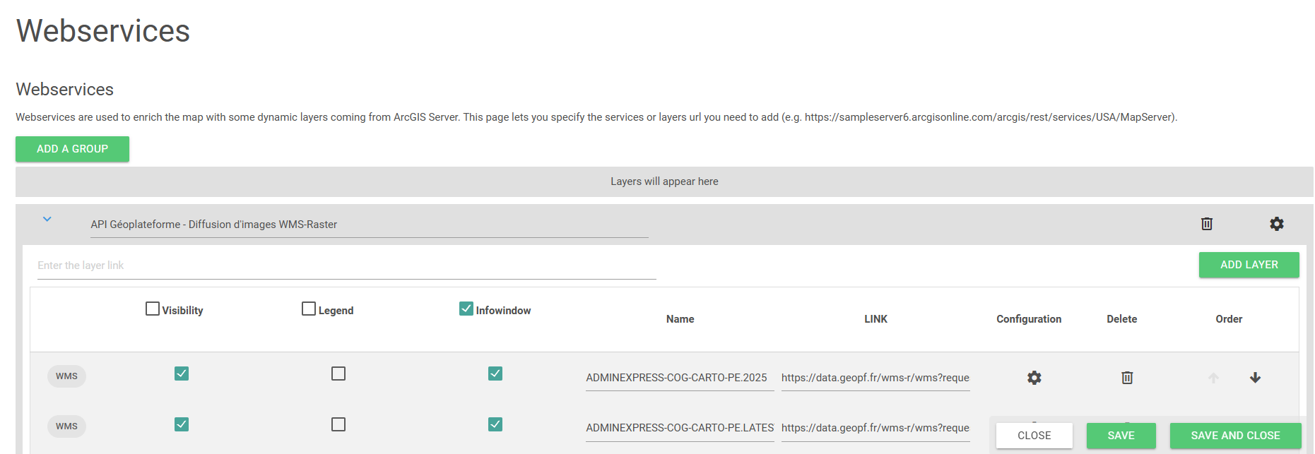
For each layer it is possible to:
- customize the name, the category and the URL
- choose the visibility status by default (visible/invisible)
- choose to display the legend
- define if the info-window displays the layer attributes (if available)
- filter the layer according to an existing prompt (by selecting the field that needs to be fed)
- delete it from the list
- move it up and down inside the group (this order will be reflected in the Layers panel)
- the groups can also be moved up and down and relative to the layers in the Layers panel using the arrow buttons in the group header
- whole groups can also be deleted using the recycle bin button in the group header
- groups names are editable
- manage the labels visibility (if the layer is supported) through the labels icon associated to every layer (in the Layer management panel)
The adding of a Webservice is done by:
- Entering the REST URL of a layer from ArcGIS Server
For instance: http://showme.galigeo.com/arcgis/rest/services/USA/MapServer/1
- Indicating the URL of the service to be added, in which case all the layers of the service are added automatically
For instance: http://showme.galigeo.com/arcgis/rest/services/USA/MapServer/1